Cooked by fire.
Led by the season.
An intimate fictional dining room built around the produce and the heat of the hearth.
- Tue–Thu
- 5:30–10
- Fri–Sat
- 5:30–11
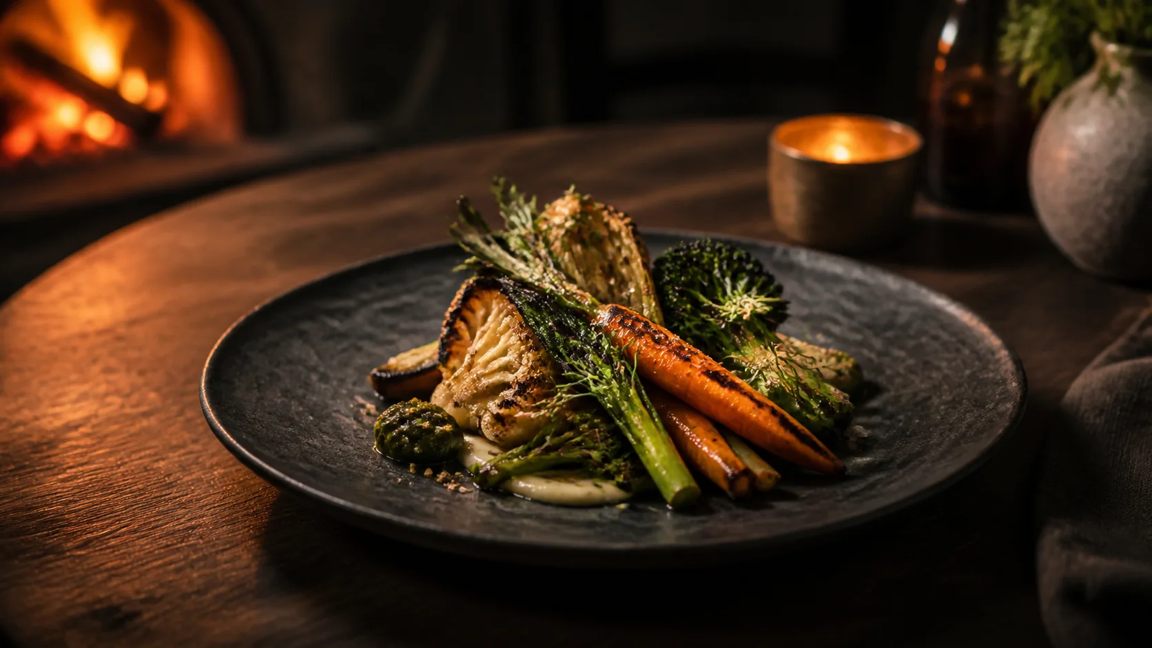 01 / Charred brassica
Build desire quickly while keeping practical details—menu, hours, location, and booking—frictionless.
Pair cinematic close-ups with concise menu language and repeat the reservation action at natural decision points.
A working visual argument, not a screenshot grid.
The concept shows how hierarchy, interaction, and a relevant business action can work together. It is intentionally not connected to live client data or a production backend.
The same idea, recomposed for the device.
The mobile version changes hierarchy and interaction rather than merely scaling down the desktop layout.
Layer, content, and action changes use transform and opacity so the interface remains responsive.
Large transforms and automatic transitions are removed while every state remains directly accessible.
Important actions use generous targets and never depend on hover to reveal essential content.
Use the idea as a starting point—not a template.
Your site would receive its own content hierarchy, visual direction, and scope.