Useful objects.
Considered slowly.
Desk tools reduced to material, proportion, and the details your hands notice.
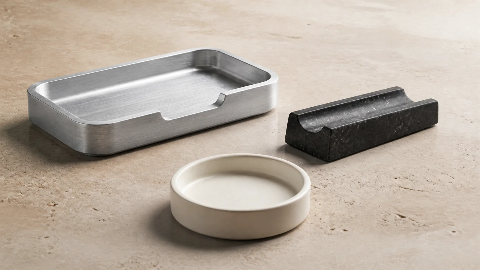
Give a small collection the depth and restraint of a premium product brand without hiding price or purchase intent.
Use material-led photography, compact product detail, and a transparent cart interaction concept. Checkout is intentionally not simulated.
A working visual argument, not a screenshot grid.
The concept shows how hierarchy, interaction, and a relevant business action can work together. It is intentionally not connected to live client data or a production backend.
The same idea, recomposed for the device.
The mobile version changes hierarchy and interaction rather than merely scaling down the desktop layout.
Layer, content, and action changes use transform and opacity so the interface remains responsive.
Large transforms and automatic transitions are removed while every state remains directly accessible.
Important actions use generous targets and never depend on hover to reveal essential content.
Use the idea as a starting point—not a template.
Your site would receive its own content hierarchy, visual direction, and scope.